Dashboards are JSON files dropped into dashboards.dir. Each
*.json becomes a dashboard whose ID is the filename slug. The
format is a deliberate subset of Grafana's dashboard JSON, so a
Grafana export can usually be dropped in and rendered with a
best-effort result. Unknown fields are ignored silently.
Bundled dashboards
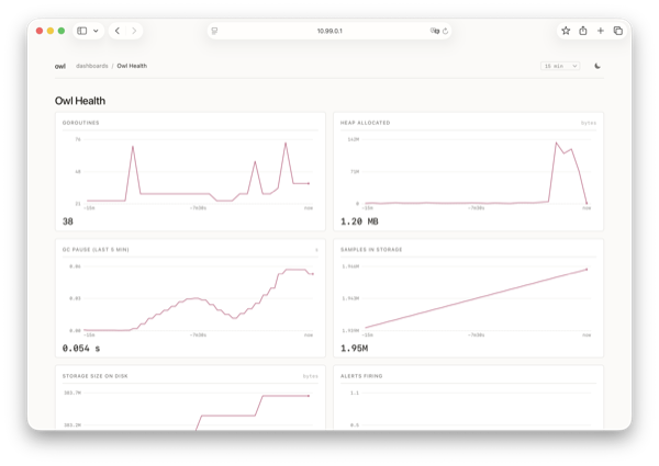
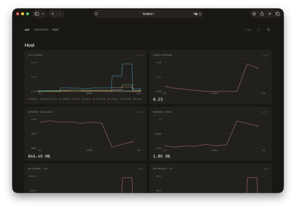
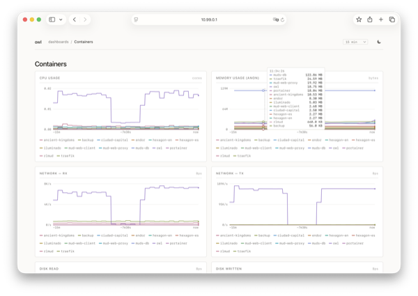
owl ships three dashboards under dashboards/ in the repo:
Owl Health (self-monitoring from /metrics), Host (Linux host
metrics, opt-in via host.enabled) and Containers (per-container
metrics from the Docker integration).
Panel shape
One panel looks like this:
{
  "id": 1,
  "title": "Heap objects",
  "type": "timeseries",
  "gridPos": { "x": 0, "y": 0, "w": 12, "h": 8 },
  "fieldConfig": { "defaults": { "unit": "bytes" } },
  "targets": [
    {
      "expr": "owl_heap_objects_bytes",
      "legendFormat": "{{instance}}"
    }
  ]
}
A dashboard is { "title": "...", "panels": [ ... ] }, optionally
with a time.from / time.to window and a refresh interval that
seeds the top-bar picker.
Supported fields
- Top level:
title,panels[],time.from,time.to,refresh. - Per panel:
id,title,type(one oftimeseries,stat,gauge),gridPos.{x, y, w, h}on a 24-column grid,fieldConfig.defaults.unit,targets[].expr,targets[].legendFormat.
Anything else in the JSON is ignored without warning so existing
Grafana exports remain syntactically valid input. Panels with an
unsupported query or type render a small explanation in place of
the chart; the rest of the dashboard still works.
Panel types
Resident memory
bytestimeseries— the default. SVG line chart with axes, a crosshair on hover, and a tooltip listing series sorted by value.stat— a single big number for the reduced sample. Suited to current goroutine count, currently firing alerts, samples in storage. See Stat panels below for the reduction options.gauge— renders the same way asstatin this version. Radial and bar gauges are not implemented.
For dense overviews, timeseries with multiple series remains the
right default — owl's chart layer is designed to make many lines on
one panel legible.
Multi-series timeseries
opsStat panels
Panels with type: "stat" (and type: "gauge", which renders the
same way) collapse the query result to a single big number instead of
plotting a line. The left example below is plain; the right one opts
into the background sparkline — hover it to scrub through the series.
Alerts firing
Load average (1m)
The reduction is driven by options.reduceOptions.calcs:
calcs[0] |
What owl shows |
|---|---|
lastNotNull |
Most recent non-null sample. Default when calcs is omitted. |
last |
Most recent sample, even if null — renders as —. |
first |
Oldest sample in the range. |
max |
Maximum across the range. |
min |
Minimum across the range. |
mean |
Arithmetic mean. |
sum |
Sum. |
Only the first entry in calcs is honoured. Unknown values fall back
to lastNotNull.
Formatting respects fieldConfig.defaults.unit (bytes, s, ms,
percent and friends use owl's standard unit table) and
fieldConfig.defaults.decimals for fixed precision. When decimals
is omitted, owl picks 0 for numbers ≥ 100 and 1 otherwise, and inserts
a thin-space thousands separator for large bare counters (1 247).
When a query returns multiple series, owl renders the first series'
reduced value. Multi-series stat is an anti-pattern for the one-number
idiom — narrow the query (e.g. with topk(1, ...) or stricter label
matchers) when you see this.
Opt-in sparkline
Set options.graphMode: "area" to draw a thin, low-contrast line
across the bottom half of the panel from the same data the number is
reduced from. Default is no sparkline (graphMode: "none" or absent).
Hovering the panel swaps the headline value for the sample under the
cursor along with the time delta, so the sparkline doubles as a
mini-scrubber.
{
  "type": "stat",
  "title": "Watchtower scans",
  "options": {
    "graphMode": "area",
    "reduceOptions": { "calcs": ["lastNotNull"] }
  },
  "fieldConfig": {
    "defaults": { "unit": "none", "decimals": 0 }
  }
}
Empty state
A panel whose reduction returns null, NaN, or an empty series renders
an em-dash (—) in a muted colour. Network errors keep the previous
render and surface the same way as on chart panels.
Units
fieldConfig.defaults.unit is rendered in the panel's top-right
corner and used for tooltip formatting. The chart layer recognises
the common Grafana units: bytes, s, ms, percent, ops,
reqps, short. Anything else is shown verbatim. Counters expressed
through rate() typically read best with ops (operations per
second); histogram quantiles read best with s or ms.
Legend templating
legendFormat supports Grafana-style {{label}} placeholders, which
are substituted with each series's label values. The bundled
Containers dashboard uses {{name}} to render one line per
container; the Owl Health dashboard uses bare label-free strings
because every metric there is single-instance.
"legendFormat": "{{instance}} · {{mode}}"
If a referenced label is absent on a particular series, the placeholder collapses to the empty string.
Grid
gridPos is positions on a 24-column grid. Owl walks the panels in
file order, places each at the (x, y) you specify, and uses (w,
h) as the cell footprint. The viewport is one column wide on narrow
screens; the grid otherwise scales to its container.
Bundled examples
The repository ships three dashboards in dashboards/:
health.json— self-monitoring from/metrics.host.json— Linux host stats (opt-in viahost.enabled).containers.json— per-container metrics from the Docker integration.
They double as worked examples: legitimate expr, legendFormat,
units and grid sizes you can copy.